
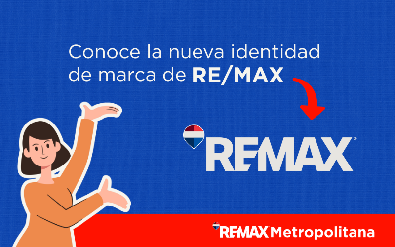
RE/MAX, a global leader in the real estate sector with more than 145,000 agents in 115 countries, recently unveiled its new brand identity. This complete refresh aims to strengthen its leadership in an increasingly digital environment and connect with new generations.
Operating through a successful franchise model, real estate portals and a powerful social media channel, the company seeks to consolidate its global relevance. It does so through a modern, cohesive redesign that responds to the expectations of both consumers and its network of agents.
Official Unveiling at the R4 2025 Convention
On February 25, 2025, during the opening ceremony of the prestigious R4 Convention, the leaders of RE/MAX revealed the new version of the iconic hot-air balloon and the logo. The design, presented simultaneously online and on social media, has as its main goal to amplify agents' presence across all digital and advertising environments.
History and Evolution of the RE/MAX Identity
The RE/MAX identity has evolved alongside the market. Its main visual milestones since its founding can be summarized as follows:
- 1973: The Birth of a Symbol: The distinctive hot-air balloon in red, white and blue allowed the company to quickly establish itself as a reliable, recognizable reference in the real estate sector.
- Early Tweaks: Over the decades, the emblem went through several updates that improved its visibility, moving toward flatter, simplified and crisper variants.
- The Pre-2025 Era: The last update before this major change preserved the diagonal bar that separated "RE" from "MAX" and kept the balloon as the central figure, consolidating its image worldwide.
Each of these redesigns has responded to the pursuit of a globally cohesive image and adaptation to new media, reflecting stages of expansion and an increasingly professional presence.
Analysis of the New Design: The 4 Pillars of the Change
The refreshed visual elements in the new design are key to understanding the new strategy.
-
Balloon 2.0
While it retains the traditional colors that guarantee recognition, its shape has been redesigned to be perfectly legible on small screens. Its silhouette remains unmistakable even when it appears without the logo.
-
Logo Without the Diagonal
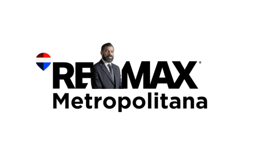
The new version drops the iconic bar that split "RE/MAX." This change creates a versatile internal space where photos of agents or clients can be inserted, placing them right at the center of the visual message.
-
Typography and Graphic Style
A more modern, versatile typeface (sans-serif) has been chosen, designed to look impeccable on all kinds of media: from high-resolution screens and print advertising to the exterior signage of the offices.
-
A "Digital-First" Approach
The entire concept is conceived from the ground up to shine in digital environments, ensuring that every detail works perfectly in mobile apps, social media and websites.
The Concept: A People-Centered Rebranding
The new visual identity revolves around people: agents and clients. By removing graphic barriers like the diagonal, they’re given the full spotlight. The brand now rests on values of closeness, empowerment and professionalism.
Sergio Felgueres, of RE/MAX Mexico, sums it up by calling the agent the "heart of the business." From the headquarters in the United States, the trust and energy emitted by this renewed presence in the digital realm are also highlighted.
Why Change? Motivations Behind the Redesign
What is RE/MAX seeking with this new identity?
- Modernization and Global Consistency: The redesign responds to the need to adapt to new consumption habits. More than 75% of those looking to buy a property start their search online and judge a brand’s credibility, in part, by the quality of its visual design.
- Connecting With New Generations: The new style targets Millennials and Generation Z directly, demographics that value aesthetics, clarity of message and an active, professional presence on social media.
- Instant Recognition: The new balloon logo stands out on both small and large screens. An internal survey reveals that 78% of staff recognize it immediately, even without the "RE/MAX" text.
Cora: Artificial Intelligence Joins the Strategy
Along with the rebranding, RE/MAX introduced Cora, a revolutionary CRM system based on artificial intelligence. The tool, set to launch in October 2025 in Mexico during the Cancún convention, aims to combine technological precision with the human touch, simplifying the tracking of leads and inquiries.
Expected Impact on Agents and Clients
The company expects a positive impact on two levels:
- For Agents: The new templates and digital resources will allow agents to personalize social media campaigns, reinforcing their visibility, consistency and professionalism. The new design places the agent at the center, both in the message and in the appearance. If this vision inspires you and you want to boost your career, discover how to join RE/MAX and be part of the future of the real estate sector.
- For Clients: A fresh, professional design conveys trust and credibility, key qualities for attracting and converting leads. The optimized version of the balloon ensures immediate brand recognition across all online platforms.
How Will the New Identity Be Integrated?
The new image will be rolled out in stages:
- Digital Environment: The change will appear first on the official website, social media profiles, ads, marketing content and the Cora CRM itself.
- Physical Environment: Although it’s not part of the initial launch, "For Sale" signs, office signage and all printed materials will be updated gradually.
A Strategic Bet on the Future
The modernization of the RE/MAX brand represents a strategic decision, not a merely decorative one. It reinforces its visual and emotional leadership in a digital context that is evolving at great speed. This rebranding shows the transition toward new generations, projects a contemporary image with purpose, adjusts to the demands of today’s market and provides its network of agents with more effective promotional and technological tools.